
Wikia is slaying us with yet another ugly layout change.
Major Changes
- The column on the right with the Wiki Activity, Chat, Videos, Photos -- it's all being eliminated. Well, apart from the Wiki Activity, which is now the only thing in the column for whatever reason.
- Unless there is for example a Character Infobox on a page. Then that goes underneath the Wiki Activity and it's really crammed and changes how the Infobox looks (granted, the only wikis that properly correspond with the layout are American Horror Story Wiki and Tardis Data Core Wiki.)
- All of the information is being crammed into the center-right of the page, so that on the right is the Wiki Activity box (though once you go below the box all of the information reaches the right) and the left is where Wikia allows you to Tweet, Facebook, Google+ the page. That's also where the new edit button is going to be.
- The font is yet again being changed to be 12pt font for Arial. The headers are now being bolded, enlarged and spaced out as well.
- There are now advertisements in the middle of pages :)))))) They basically look like a photo is supposed to be there. In the middle of the page and like a picture.
- The Navigation menu is being changed. While the headers for the navigation menu essentially remain the same, the categories per that header are in a list-like formation and the dropdown menu comes from the side now. So much for its beautiful customization ;-;
Try Yourself
The two Wikis that are currently being tested with the new layout are American Horror Story Wiki and Tardis Data Core Wiki. The changes only work on articles so far and have yet to parallel with the main page.
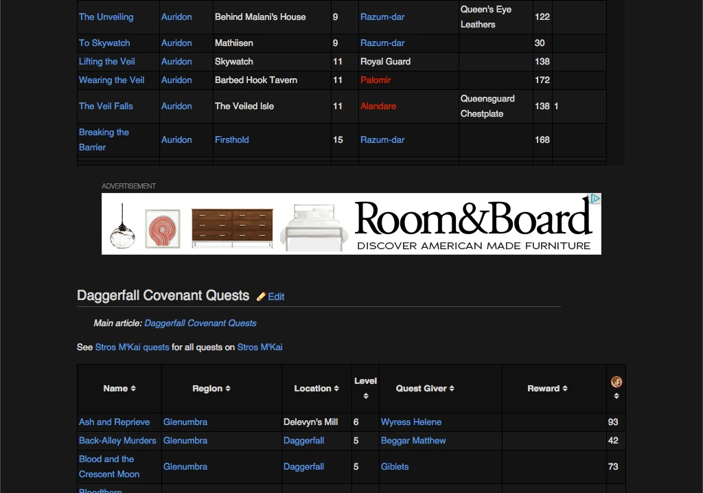
Alternatively, you can see these changes with any wiki, though like I said before they don't properly correspond. To see these changes, just add "?useskin=venus" to the end of the URL. Here is how some of the pages on this Wiki would look with the layout:
Other
There hasn't been any firm date for when this layout will be implemented for all wikis. Hopefully, we can change back to Oasis or Monobook through our preferences, but it is probably customarily the Venus layout for when the wiki is randomly clicked by an anon. Note that the design is still under construction, so some of what we see may not be there when it's implemented.
What do you think? Do you think it's ugly? How will this affect your other Wikis? Comment below yo


